
Tuesday, June 7, 2011
Lord of the Scribes
Monday, September 6, 2010
Before my Vacation
Here is the set of images before my two week vacation in Italy and France.


The two image above are small drawings. I am using a repeat of the triangle, square and circle in each, with various horse images, at least in the image on the right side.


The image on the left I choose to just repeat the head of the horse, and weld it to various legs. There is nothing automatically correct however in how the images are composed. The study on the right side is rough, but important because I incorporated some of this style in later drawings.


The study on the left side is very much like what I did last week. The study on the right I started to take a new direction. In this study I have started to change up the scale of the horses from smaller and full body, to just the full head which you can see in the upper right hand side. The repeat element here are the arcs through out the image.


The last two studies I did are above. The first is a simple study placing the abstracted horses on the right hand side of the paper, and again changing the scale of the images. The last study I considered the most important study of all the drawings of the week. On the left I have stacked three horses, with one clock. The middle horse has an angry eye, which has its origination from the clock. The upper horse is also tied and originates from one of the hands of time. That image weighs against FIVE horses, three clocks, a triangle all set upon a massive square. This highly structured design represents set time. The horses and single clock coming from the left to the right represents rouge time, or a "black swan" like event.
It is a complex composition that uses many elements from all of my studies. This is simply not something I would have been able to compose even six months ago.
Out of everything I have done over the past year, this image really makes a huge leap in composition, design and depth. It feels like it is miles ahead of my earlier work called the Ascension of Time. It has numbers ( 3, 5 ) shapes ( triangle, square, circle), and life ( the horses ) and meaning ( I am showing the viewer a philosophical concept of time and rouge events).
So, I have taken this final study a step further into a study painting.

This is the painting, but in photoshop I have removed the color and just done it in Sepia for a very different effect. But the painting is in color as see below.

I added the ball of gold in the upper left hand corner for force. It is composed in spirals which pass through the eye of the middle horse and into the formation of fixed time. This painting is done with gold leaf on canvas, and phaleo blue paint. I also used iron mica for shading in the main images.
It is no mistake that the painting is lighter on the left hand side than the right. I am using the darker colors of the right to draw the eye. Plus, the images on the left side are meant to be less solid in color than the set time images on the right hand side.

Here is an antiqued image of the same painting.
So, this week I did several studies on repeated elements, and developed one of these studies into a full painting taking the concept the next step in evolution. My fascination with the nature of time, which shows up in many of my pieces, has returned with a force.
As please as I am with this study, it is still a study and I believe there is room for improvement upon this composition, and its execution as a painting.
Now, two weeks in Europe checking out Picasso, Luzatti, Matisse, Chagall, and many others.
Wednesday, September 1, 2010
Iphone and the Gods
Here is the process I took to get to this image. It is a relatively small study, and not as "clean" as I would like to see in a final production.


First, I laid down a layer of copper and gold leaf, applied a drawing ground, and then proceeded to apply the writings.
This is my base layer.

Here is the end result of that first process that took about 3 hrs of work, using a bamboo pen, and black ink.

I applied two layers of transparent glazes. One layer was a transparent gold, and the second was a turquoise blue.

I sketched in the drawing, started to apply layers of paint, slowly. As you can tell the Iphone at first was transparent. I kept the man worshiping or honoring the Iphone transparent as a way of subtle contrast of importance. I am saying that the Iphone is actually more real that the man to the left.

Here is the final version of the study. I used zinc white, but heavy, applied on the man to give more contrast, but tried to keep him just transparent enough to allow the writings on the base layer to still be seen in the image.


And this is a small study. The image size is 16x20, and the first time I have used canvas to create on of these gold leaf paintings. A larger study, or final piece would allow far more detail.
Tuesday, August 31, 2010
New Ideas, New images, New Lines
This is the most recent set of images I have been working on the past few weeks. Enjoy.


Textu, God of the Text Messaging. This is apart of my more recent vein of Ancient Pop Art.

Two designs for my art class.

And two more designs for class.

And another. There is a contrast of lines in this one.

This is likely to become a study for a larger painting in the future. I am taking the form of the ocean waves and combining this with the form of the horse in motion. I used the cubism within the waves and horses as a form of contrast to the flowing forward motion of the other lines. The eclipses are just a background, which I kept less dense compared the the waves of horses below.

Again, I am using the form of the horse, but this time I have started a continuous line from the upper left hand corner flowing through the entire page. There is contrast of shading between the outer section and inner section.

This is a close up detail to draw attention to the contrast of lines between the main contour line that separates the the spaces of darkness and light, and the very thin lines in the darker shaded area that are repeating key forms of the horse. I got this idea from studying some Picasso Ethchings from 1968.

And the final image is another contrast of lines. I have very soft broad lines in the foreground which are the horses, with very sharp lines in the background, and some sharp thin lines again in the foreground repeating key elements of the horse.
Monday, August 16, 2010
Egyptian Cubistic Design Homework. Week Six

This entire design is based upon the square. The first step was laying out my page, and determining some points of reference.

There are 19 points of reference on this paper now. I used a compass to divide the sheet of paper up into these sections.

I then erased the various marks that were used to find the points of reference.

Then, using the points of reference as corners of squares, I started the blot out various squares on the sheet of paper using a template of squares, building a design that appeared random, but was anchored in the original design of 19 points of reference.

Eventually, I had filled in the page enough to begin the next step of this piece, which is inserting various symbols, and images taken from the Book of the Dead.


After I had filled in the design with enough symbols, I went back and started shading the lines, and adding more variance in the lines, trying to move past the very straight lines I had when I started my design.

The final step to get and idea of what this could be like as a painting, I imported it to photoshop and applied some texture and tint to the image.
And, so there you have it. I have used a cubism like design to re-state some of the ancient symbols found in the Egyptian Book of the Dead.
I feel like I have just scratched the surface on the potential that is here for taking something old, such as the art work and symbolism of the ancient Egyptians and brining that into the 21st century by using a cubistic design, be it based upon the square, triangle, circle, or any combination of all three.
For this work, I choose to keep it relatively simple by just sticking to the square, however even this piece is rather complex. It is not just randomly placed onto the page as at first glance one would assume. The reason I took great pains to show each step is because I wanted to demonstrate the design principles that were present at every single step of the creation of this individual drawing.
The total time this sketch took was approximately 2 hrs. The image size is 7x10 inch.
week six of my studies
Below are a few rather tribal works, basically just sketch work of cave paintings, and symbols.


This kind of work will be used with cubism in the very near future.
Monday, August 9, 2010
Not one more thing!!!
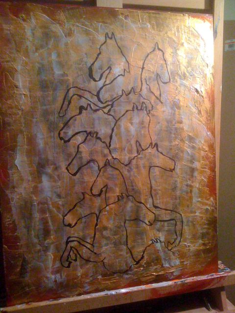
I have been preparing this board for a few days. The original drawing that I had done did not turn out well, so I just kept piling on more acrylic glazes with tints of pigment. You can still see parts of the original drawing, but now I have made a new drawing on top of all the layers. I just had to stop because I was afraid that one more mark, and I was going to screw this one up too.


I am really pleased with this test painting, and the potential this entire abstraction of the horse study has in the future.

Underneath everything here is a layer of copper leaf. I have about 7 layers of glazes on top of that base layer.

I chose to not add into this study much of the cubism detail that I had in the original drawing because I felt that it detracted from the sense of space and form of the horses contour lines contrasted to the overall surface environment. I really now believe this is time well spent because this study has enabled me to see the potential for much larger versions of this work.
Subscribe to:
Posts (Atom)